The Basics
Learn Data Visualization for fun and profit! Data is only helpful with a way to visualize it. We’re dealing with an assault on our senses with the sheer amount of data coming our way. In the Information Age, your ability to present compelling data is an asset.
Data Visualization is often an art form, but we’ll review standard options.
Primary Use Cases
Why would you want to visualize data?
- To show your pointy-haired boss the quarterly results
- To be data-driven
- Sell an idea
Know Your Audience
A succinct Venn diagram will quickly convey meaning but won’t tell a lengthy story.
Ask yourself these questions before building your visualizations.
- Do I need to visualize my data?
- What value does my visualization add?
If you’re not sure, ask your audience. If you can’t answer the previous questions after a chat, drop the task!
Otherwise, carry on and ask your audience more questions.
- What’s the simplest way to tell my story?
- Who’s my audience?
- What does my audience need to know?
- How far does my audience want to go down the rabbit hole?
- Do I understand the source data?
Before creating data visualizations, interview your audience to learn which stories they want to hear.
Know Your Goals
Are you convincing your stakeholders to invest in performance improvements? Are you trying to visualize sales information?
Mindfulness of your goal is essential.
Define key performance indicators to increase visualization impact. If you’re convincing investors, one of your KPIs may be a signed check.
Choose Your Weapon
Many visualization widgets exist, but we can tell most stories with basic charts.
Here are five of the most common widgets.
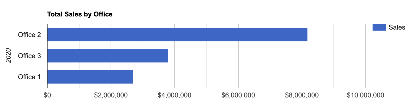
Bar Chart
A bar chart or bar graph presents categorical data with adjustable rectangular bars proportional to numeric values.
Plot bars vertically or horizontally.
A vertical bar chart is sometimes called a column chart.
Example
<div id="chart_bar_div"></div>
<script type="text/javascript">
google.charts.load("current", { packages: ["corechart", "bar"] });
google.charts.setOnLoadCallback(drawBasic);
function drawBasic() {
var data = google.visualization.arrayToDataTable([
["Office", "Sales"],
["Office 2", 8175000],
["Office 3", 3792000],
["Office 1", 2695000],
]);
var options = {
title: "Total Sales by Office",
vAxis: {
title: "2020",
},
hAxis: {
format: "$#,###,###",
},
};
var chart = new google.visualization.BarChart(
document.getElementById("chart_bar_div"),
);
chart.draw(data, options);
}
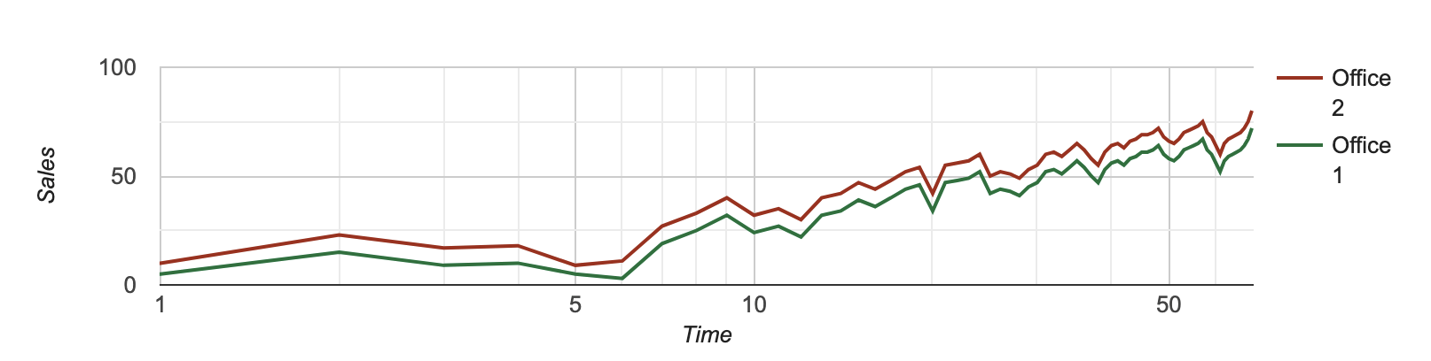
</script>Line Chart
A line chart, line plot, line graph, or curve chart displays information as a series of data points called ‘markers’ connected by straight line segments.
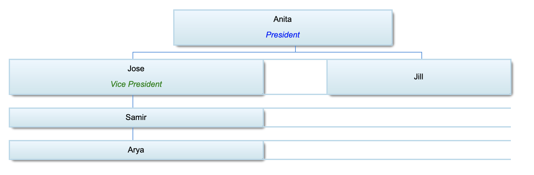
Flow Chart
A flowchart is the superset of an org chart, a standard flowchart. A flowchart represents a workflow or process. A flowchart can be a diagrammatic representation of an algorithm, a step-by-step approach to solving a task.
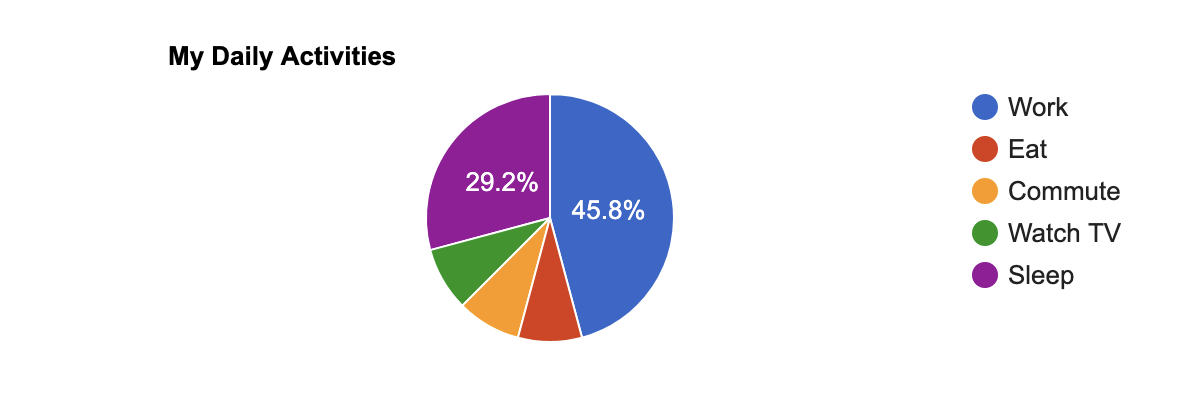
Pie Chart
A pie chart — or a circle chart, is a circular statistical graphic divided into slices to illustrate numerical proportions.
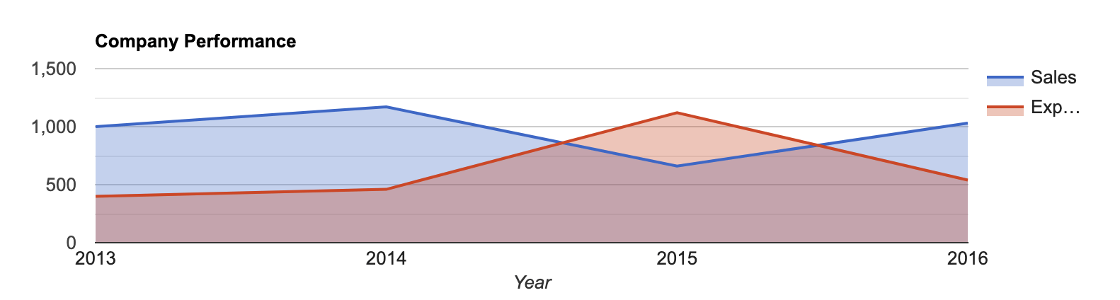
Area Chart
An area chart or area graph displays quantitative data. It’s derived from the line chart. The colors, textures, and hatchings between the axis and line provide emphasis.
Compare two or more quantities with an area chart.
Color Your Theory
Use color theory to pick an appropriate color scheme.
Try using a color palette generator to explore color theory.
Learn Data Visualization - Beyond the Basics
Videos
- Data Visualization: Best Practices - LinkedIn
- Data Visualization: Best Practices - Pluralsight
- Communicating With Data - Udemy
- Telling Stories with Data - Udemy
- Color Theory Fundamentals - Pluralsight
Books
- Stories That Stick - Amazon
- Effective Data Storytelling - Amazon
- Killer Visual Strategies - Amazon
- Effective Data Visualization - Amazon
- Design Elements, Color Fundamentals - Amazon
References
Related Articles by Category
📉 Data Analysis
Examining data to discover patterns, trends, and actionable insights.
📊 Data Science
Extracting insights and knowledge from data using scientific methods and algorithms.
🎨 Design
Design principles and practices for software and interfaces.
Comments #